Announcing: Counterpoint!
Announcing an awesome new large-scale animated visualization tool from Venkat Sivaraman! Counterpoint helps orchestrate animated data visualizations by providing a robust framework for state management.
The researchy abstract
Custom animated visualizations of large, complex datasets are helpful across many domains, but they are hard to develop. Much of the difficulty arises from maintaining visualization state across many animated graphical elements that may change in number over time. We contribute Counterpoint, a framework for state management designed to help implement such visualizations in JavaScript. Using Counterpoint, developers can manipulate large collections of marks with reactive attributes that are easy to render in scalable APIs such as Canvas and WebGL. Counterpoint also helps orchestrate the entry and exit of graphical elements using the concept of a rendering “stage.” Through a performance evaluation, we show that Counterpoint adds minimal overhead over current high-performance rendering techniques while simplifying implementation. We provide two examples of visualizations created using Counterpoint that illustrate its flexibility and compatibility with other visualization toolkits as well as considerations for users with disabilities.
See the project here: https://dig.cmu.edu/counterpoint/
The best part: An accessibility-focused infrastructure
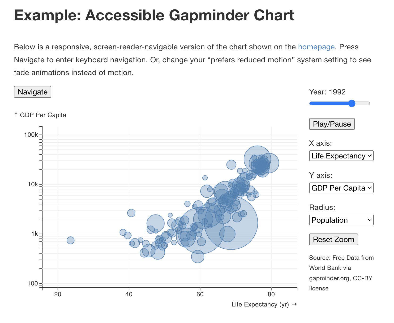
The best part of Counterpoint is that Sivaraman’s approach easily enables a low-level accessibility toolkit like Data Navigator by converting state into a graph structure.
This makes Counterpoint one of the first projects of its kind! The fundamental building blocks of this animation toolkit work exceptionally well with accessibility building blocks.
Architecturally this is a beautiful harmony that will hopefully make it far easier to build best-in-class animations that are also great for people with motion and photosensitivity disabilities as well as anyone who uses a screen reader.
Big bonus: It’s got broadly-applicable accessibility documentation
And the awesome part is that there is accessibility documentation written up with some of the most important considerations to keep in mind when animating data!
I’ve never seen this before! This is a great resource for anyone animating data anywhere.
And believe me: I read and keep track of accessibility documentation and guidelines constantly. There just aren’t good resources out there for making animations more accessible. And Sivaraman covers the absolute basics really well. So even if you aren’t using Counterpoint, it might be worthwhile to bookmark the docs: Counterpoint’s “Accessible Rendering and Navigation” Guidelines.
Further reading and getting started
I am so proud to have been able to lightly advise Venkat while he worked on this. I am blown away with how powerful the toolkit is and that it works seamlessly with Data Navigator too. What an awesome project!
You can download and access the paper for Counterpoint here.
And you can check out Counterpoint on Github here.